
 We’ve all encountered really good design work. You know what I’m talking about: the kind that stops you in your tracks, causing you to linger for a moment, ruminating on the feeling it promotes. You may not even initially dwell on the product or service, but there’s something about it that draws you in. Whether it’s the website for your local market, a brochure for a corporation or even a poster advertisement, a solid design makes the audience take notice and want to know more.
But what goes into creating those quality design concepts that promote and engage?
Know Your Audience
Before you get started, it’s important to know who uses the product/service you are trying to promote – for example, landscaping services are very different from, say, financial services. Aunt Martha is a WWII widow and Ashley is a millennial in college – how can you sell the same thing to these very different people? Does the client want to expand or change their client demographic? Where do most of their customers live? Questions like this can help you understand the target market before you begin.
Be Creative
No one wants a brand that feels like just another version of an existing brand. While all designers seek out current trends for ideas, try to tap into your own original, personal blend of uniqueness to come up with an honest, individual design, even for something as simple as icons. Push yourself outside of your comfort zone and explore your capabilities. Keeping a notebook on you at all times is a great habit – the creative juices don’t often adhere to the schedule you prefer to keep, and you never know when inspiration may strike.
Maintain Balance
Who knew? Proper balance and alignment are not just for your tires – they are also crucial to a successful design. Using a grid can help maintain alignment of your elements, but your eyes will be the best judge in regards to balance. Typeface weight needs to work with photos and other graphic elements so that the important things are not overshadowed. Lines should be weighted complementary to font and margin lines can help to anchor text blocks.
Color Theory
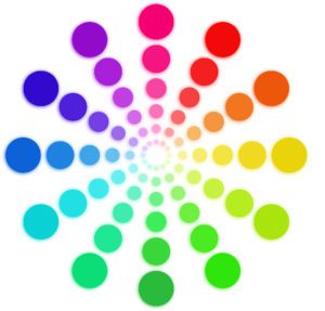 The color wheel that we are all familiar with was first developed by Sir Isaac Newton in 1666 and, for centuries, it has been the mainstay for designers the world over. Of all the choices when creating unique design work for marketing purposes, those involving color could be considered “make-or-break,” and color theory can help you understand how they all work together.
There are generally three basic types of colors: primary, secondary and tertiary. Primary colors are those which cannot be broken down any further (red, blue and yellow), secondary colors are those which have been created using two primary colors (purple, orange and green) and tertiary colors are created by blending primary and secondary colors together, resulting in an array of hybrid colors.
Colors are charged and can evoke certain emotions from your intended audience. Selecting the right visual tone for your design will help to get your message across honestly and clearly. For example, a warm color scheme can help to convey a sense of happiness, passion, and energy, while colors from the cooler side can reflect calmness, serenity, and peace. Black indicates a sense of power and importance, while white, gray, and brown tend to be quite neutral.
Typography
 As with colors, “fonts have feelings, too,” one might say, but the most important thing is that the audience can clearly read it. There are two main designations for font: Serif, a font family which conveys elegance and sophistication (Times New Roman, Garamond, Baskerville) and Sans Serif, which is typically more modern, friendly and solid (Arial, Franklin Gothic, Futura). You will find that sans serif font families dominate online, while serif fonts tend to appear more often in print.
Visual uniformity is the goal, so keeping it to one typeface/font family can work in your favor, using italics, bold and condensed versions to mix things up. You can also use scale to your advantage, using words as art, with oversized and graduated font sizes to indicate depth or motion. As always, remember that lighter font colors should be used against darker backgrounds, and vice versa. Likewise, finer typefaces (many serif fonts) may need some boosting to help them stand out against a colored background.
White Space Is Your Friend!
Filling up all the available design space with content is not going to help anyone, least of all your client. Using negative space to your advantage can help draw the audience eyes where you want them to be. Surrounding text boxes, images and other graphics with empty space allows the elements to breathe and the eye to relax.
K.I.S.S. (Keep It Simple…)
Keep your fonts, colors, and frames to a minimum, your contrast solid and your concept clear. Over-thinking can clutter not just your brain but also your work. Just remember that every element in your design needs a purpose.
Relax!
You’ve got this.